Mixology - Figma
Key Question: How might we make easy drinks at home?
Problem
During the pandemic, it becomes inconvenient for people to go out and grab a drink at bars as well as go to cafes. Some find the cost of getting drinks unreasonable and want to learn how to make it on their own. The common platforms users use to find recipes are YouTube and TikTok. However, those videos are sometimes too long or hard for users to follow. The existing apps on the market usually contain too much text and not enough pictures and videos.
Solution
We made an app to make tutorials easy to follow with text, images, and short videos. The homepage will recommend trending drinks for users to discover, and afterward, users can share their final product within the community.
Tools
Miro
Figma
Team
3 UI/UX Designer
My Role
UX Design
UI Design
Research Users
Timeline
Overall: 10 weeks
Discovery & Research: 2-3 weeks
Design & testing: 7-8 weeks
The Design Process

Surveys
After having an idea for our project, we started researching our potential users and understanding their situation.
First, we did an online survey and shared it with various relevant communities. In the survey, we included basic questions such as preferences for getting their drink recipe, use of the recipe app, and presentation on the app. In just a few days, we received 54 results.
Later, we dive in with more profound user research on more specific questions and focus on five potential users.
How much money do you spend on purchasing drinks per week?
What comes into your mind when you first hear the word "drink"? What color do you associate with "drinks"?
Are there some functions that you would like to see in the app?
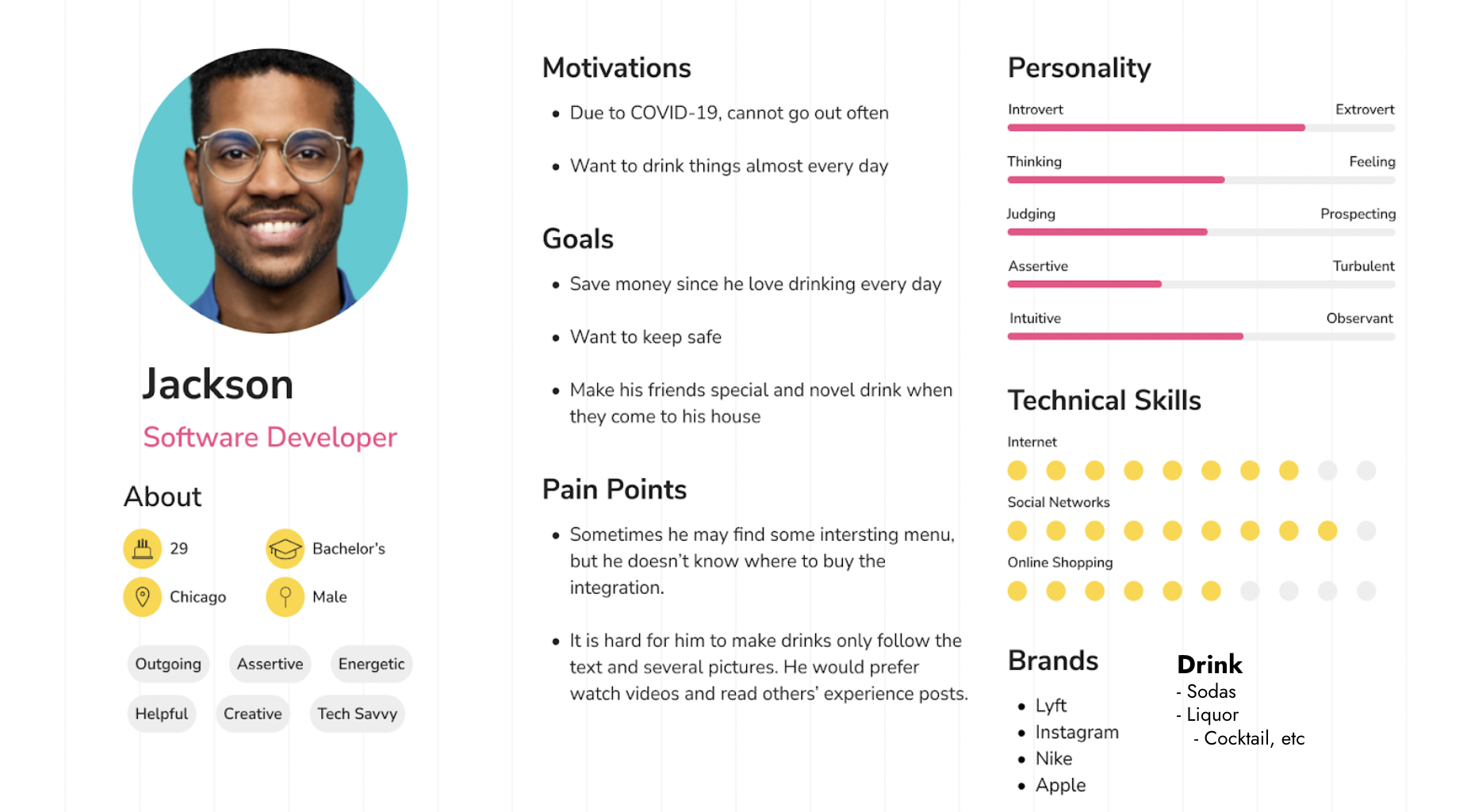
Persona
Jackson
A 29-year-old male with a stable job, income, and enough leisure time.
Due to COVID-19, he is not able to go out a lot.
His goal is to save money.
He wants to learn how to make drinks at home to save some money and stay safe, to the best of his ability.

Sitemap
In the beginning, we came up with a sitemap including all the features we wanted to include in the design.

Notes from the interview
User Journey Map for Jackson
UI Design
After deciding on the topic, we listed all the features that would be included in the UI design. We made wireframes to focus on the space and prioritization of the content.
In the next step, we moved to Figma and developed a low-fidelity prototype. We then decided on our color palette and font to produce a high-fidelity and working prototype. Our goal was to create a visually appealing interface that is efficient and comfortable for users to interact with.
Our color palette idea came from our interview. We realized most interviewees associated the color brown and light yellow with the word "drinks."
Figma working prototype: https://www.figma.com/file/U2onlz5Dic1KbfgBnugfkG/Mixology%2C-Interactive-Prototype?node-id=0%3A1&t=fJ5bFEWi3MbJHhxY-1


Next Steps
We would like to invite users who have participated in the low-fidelity prototype but didn't get a chance to interact with the high-fidelity model after it was built. This way, we can evaluate whether we have fulfilled the user's expectations and what other corrections could be improved. We could also add more technical features and develop our design into a responsive design that works for laptops, iPads, and mobile phones.
From this project, I got a chance to dive deeper into using Figma. At first, I was overwhelmed by the number of features available, but I realized that the best way to learn was to dive right in and experiment. This project made me grow as a designer by allowing me to practice not only UI design skills but the ability to understand and research user needs and get helpful feedback so we could improve our designs. The project also pushed me to think deeper when designing, not only about how the interface should work but also about details, such as deciding the color palette and typography.